
In use at BMW | Q Methods App
BMW Quality Management Training Platform
Role
UX/UI Designer & Visual Identity Designer 100%
(Collaborate with 3 engineers & Project Lead)
Time Frame
4 months
Apr - Jul 2025
Tools
Figma, MS Power Apps & Photoshop
Client
BMW Quality Management Dept.(Germany, UK, Austria)
🤖 AI Integration
Proposed content categorisation concepts, leveraged AI to generate alternatives, and refined the final information architecture.
Overview
What is Q Methods App?


The Q Methods App is a multilingual internal training application designed to help BMW employees learn quality management methods through an engaging and interactive learning experience.
Problem
Making Sense of Complex Learning Content
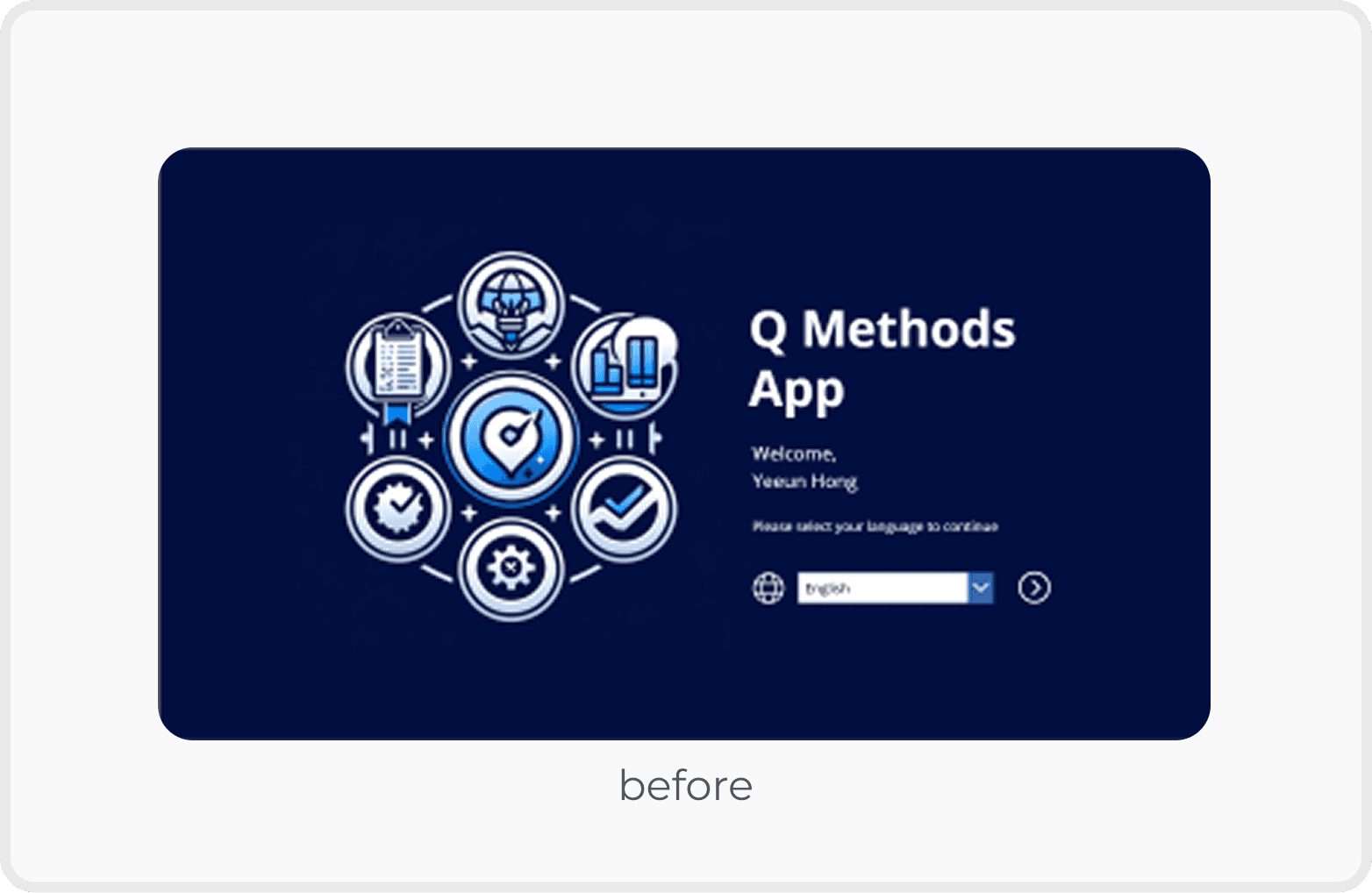
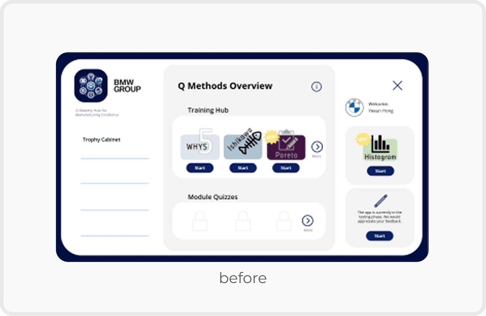
The existing Q Methods App presented a large amount of educational content in a dense and unstructured way, making it difficult for employees to navigate, absorb information, and stay engaged throughout the learning experience.
Business goal
Make learning more interactive and engaging.
Improve the usability of content-heavy learning materials.
Maintain a professional visual identity suitable for an internal BMW training platform.
Ensure all solutions were feasible within Microsoft Power Apps.
Problem
User Interview & Key Insights
Reviewed findings from in-depth interviews with 8 employees to identify key usability issues and opportunities for improving the learning experience.

Key Insights
01. Information was difficult to scan.
Large amounts of text and limited visual hierarchy made important information difficult to identify quickly.
02. Users lacked clear guidance throughout the learning journey.
Employees found it difficult to understand where to begin, which chapter they were viewing, and what to complete next.
03. Important actions were easily overlooked.
Primary actions were not visually prioritised, reducing discoverability.
04. The learning experience felt static.
The existing interface provided limited interaction and visual feedback, making learning feel passive despite the rich educational content.
05. The growing number of screens affected efficiency.
An increasing number of screens slowed development and impacted loading performance within Microsoft Power Apps.
Problem
How Might We Statement
How might we transform a content-heavy internal training app into an intuitive and engaging learning experience while maintaining technical feasibility?
Opportunity
Turning Insights into Design Decisions

Solution
Design Strategy
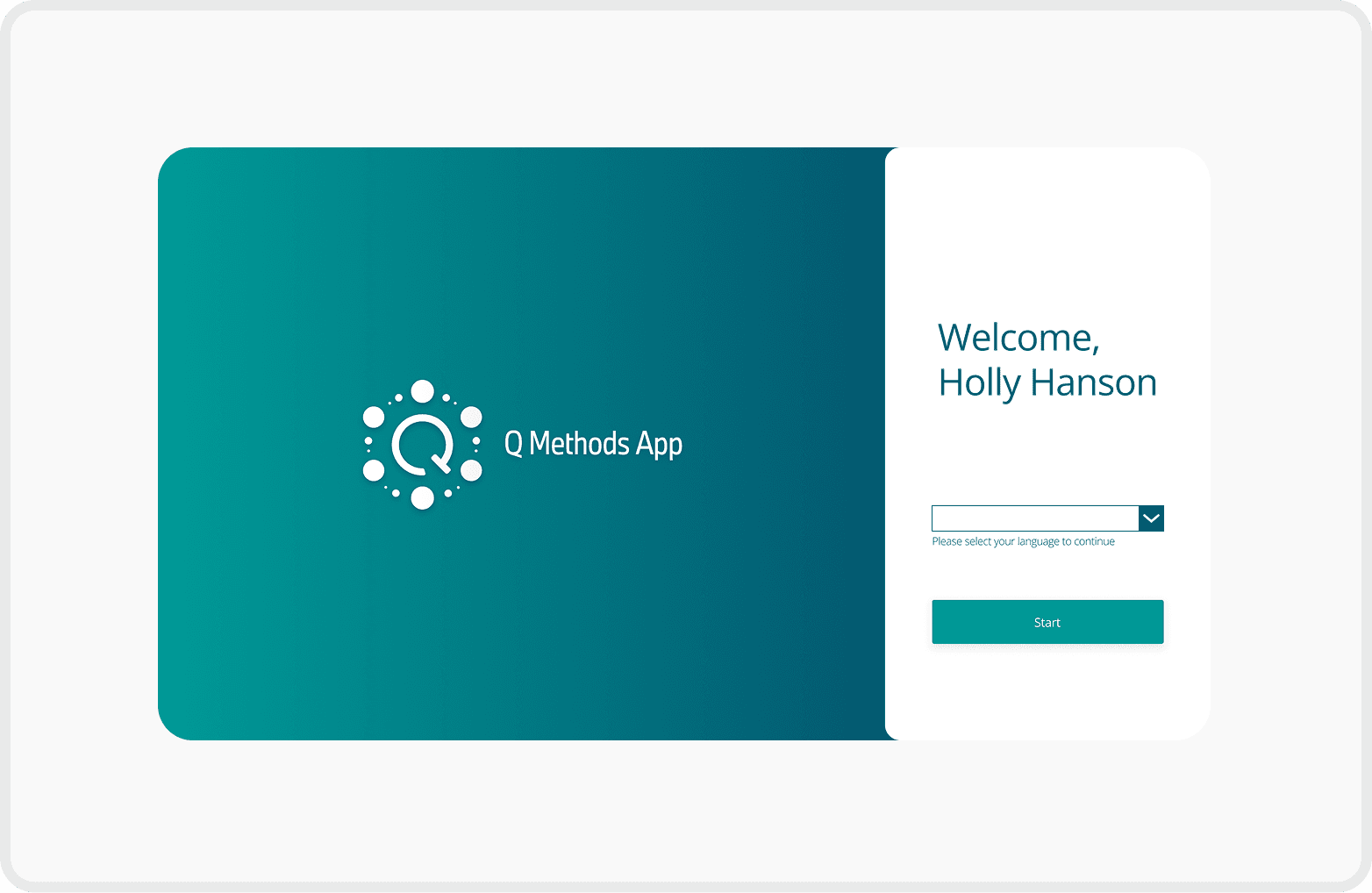
Balanced Visual Hierarchy
Reduced the logo size to balance the overall layout
Enlarged the "Start" button to enhance visibility and encourage user interaction
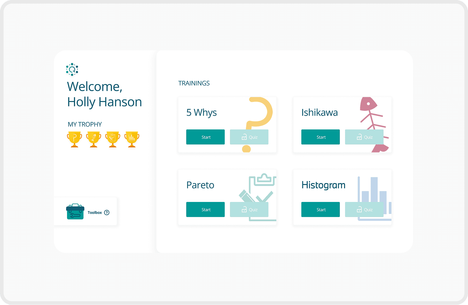
Clear Seperation for Better Focus
Improved user focus by clearly separating the profile section from the training list
Added unique icons to each training to help users quickly identify and differentiate content
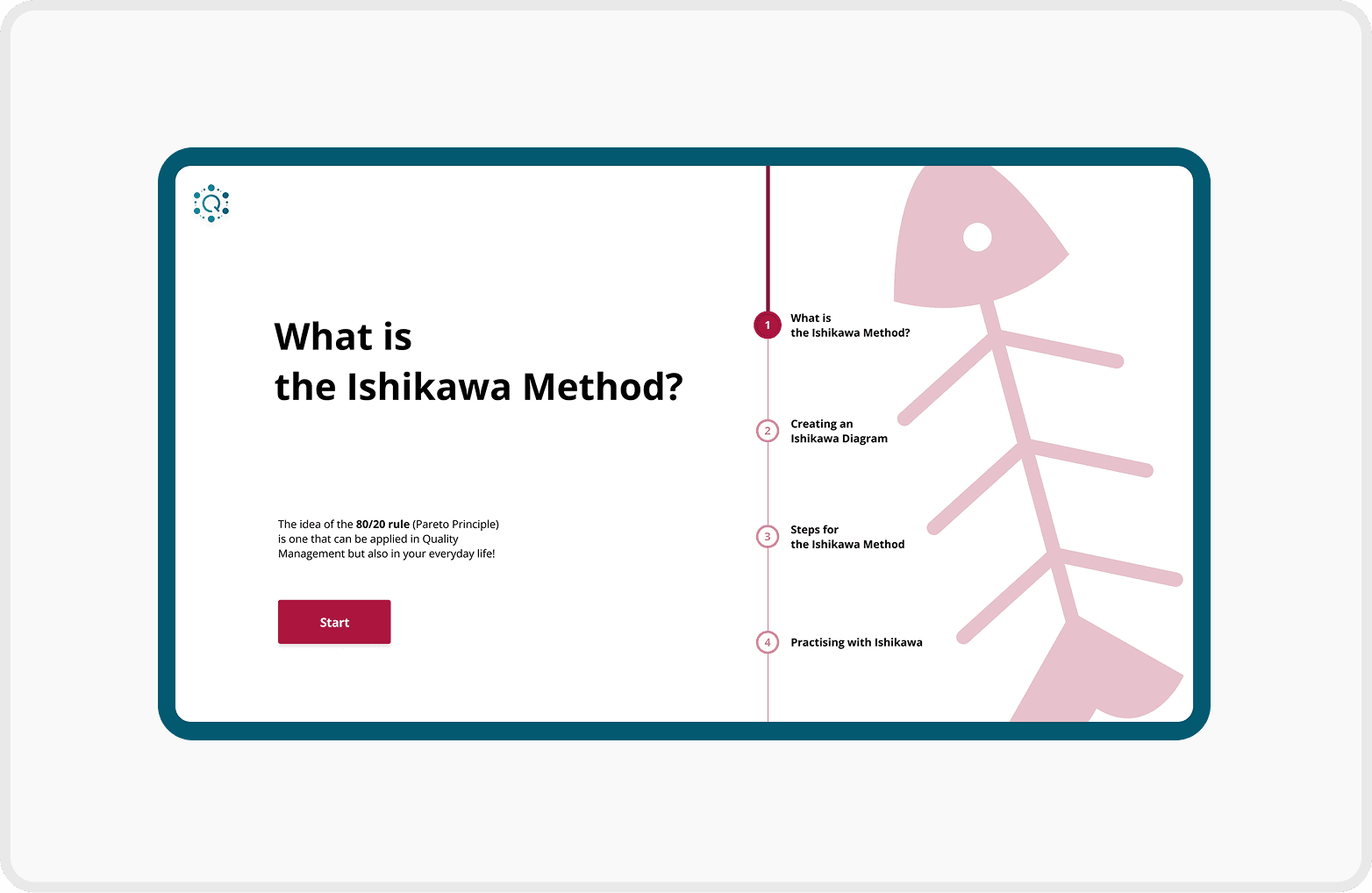
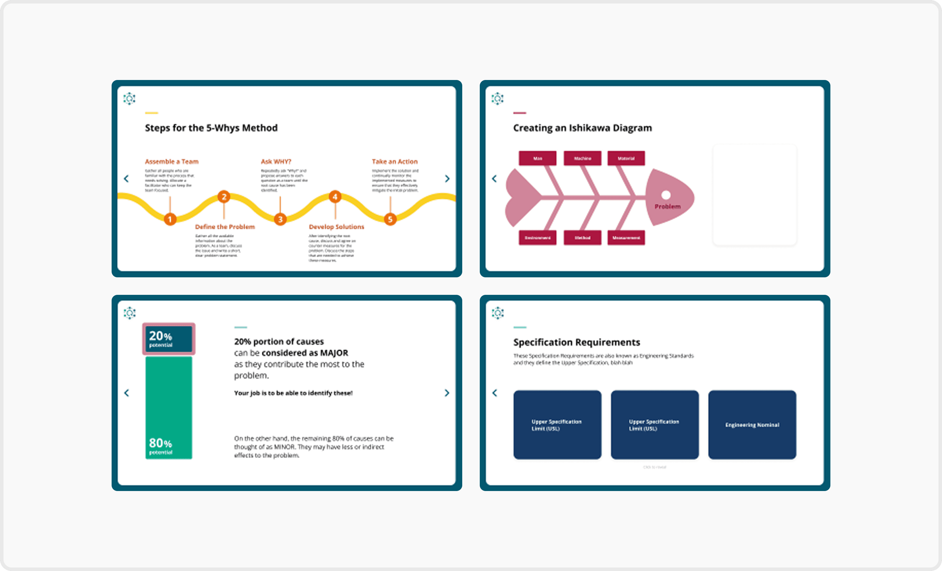
Structured Navigation with Progress Feedback
Introduced chapter overview pages for better context and smoother navigation
Added a progress bar to each chapter page to visually communicate learning progress
Visually Guided Contents Page
Added color-changing icons next to each training title to indicate the current selection
Used the brand’s green background to reinforce identity
Applied accent colours to distinguish each training and improve visual consistency
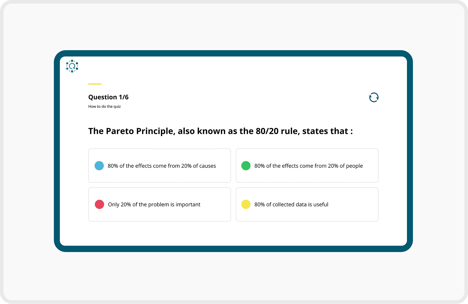
Clear and Interactive Quiz Layout
Included progression text (e.g. "Question 2/5") to inform users of their current position in the quiz
Applied different colours to each multiple-choice option to enhance visual separation and reduce cognitive load
Validation
Q Forum Highlights
Conducted user testing with 64 employees from the Quality Management departments in Munich, Leipzig, and Regensburg, collecting qualitative feedback on usability, navigation, and the overall learning experience.


Key Feedback
Positive
Easier to navigate through training content.
Improved readability of information-heavy pages.
Clearer learning progress and chapter structure.
More engaging visual experience while maintaining a professional look.
Negative
"It would be helpful if the app remembered where I left off."
"Some text could be larger for easier reading."
Future Opportunities
Add a search and bookmark function for faster access to specific topics.
Allow users to bookmark frequently used content.
Provide personalised learning recommendations.
Increasing the font size would make the content easier to read, especially on content-heavy pages.
Reflection
What I'd Do Differently
Bridge Design and Development Earlier
Align design decisions with Power Apps capabilities earlier in the design process.
Collaborate with developers from the beginning to reduce implementation gaps and enable a smoother handoff.
What I learned
Good Design Is More Than Visuals
Great UX design requires understanding the development environment, not just creating visually polished interfaces.
Early collaboration with developers leads to more realistic and implementable design solutions.
Brand Identity
Simplifying the Logo
From Inconsistent Visuals to a Unified Identity
The existing app lacked a clear visual identity, making the experience feel fragmented across screens.
By introducing a structured colour system inspired by BMW's corporate branding and refining the logo, I created a more cohesive and recognisable identity for the Q Methods App.
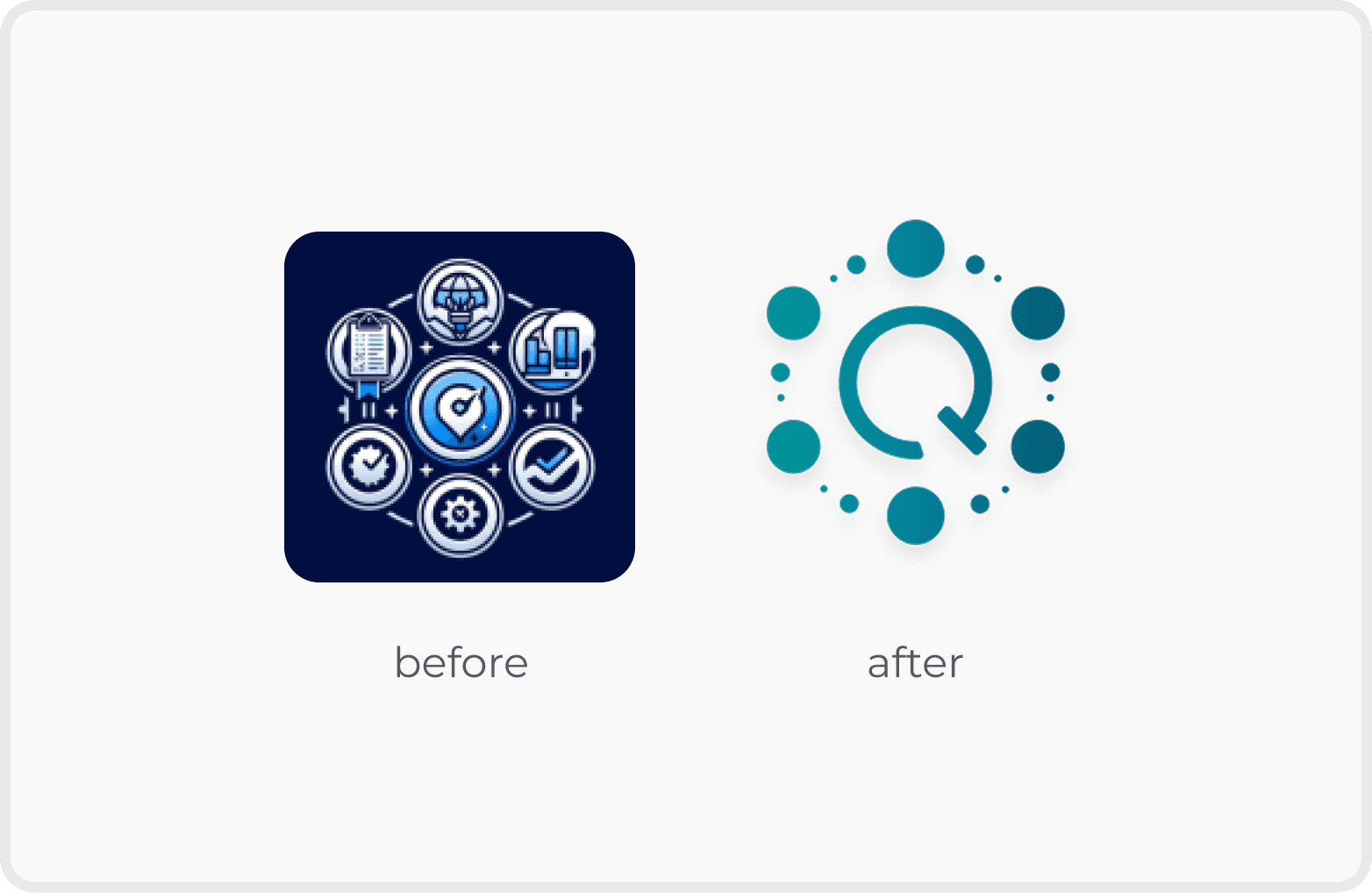
Logo Design
I retained the original shape and incorporated the letter ‘Q’ to represent the project’s identity, creating a simple and modern logo for the Q Methods App.


Logo Variations
Design System
Simplifying the Logo

Colour System
Font


Components
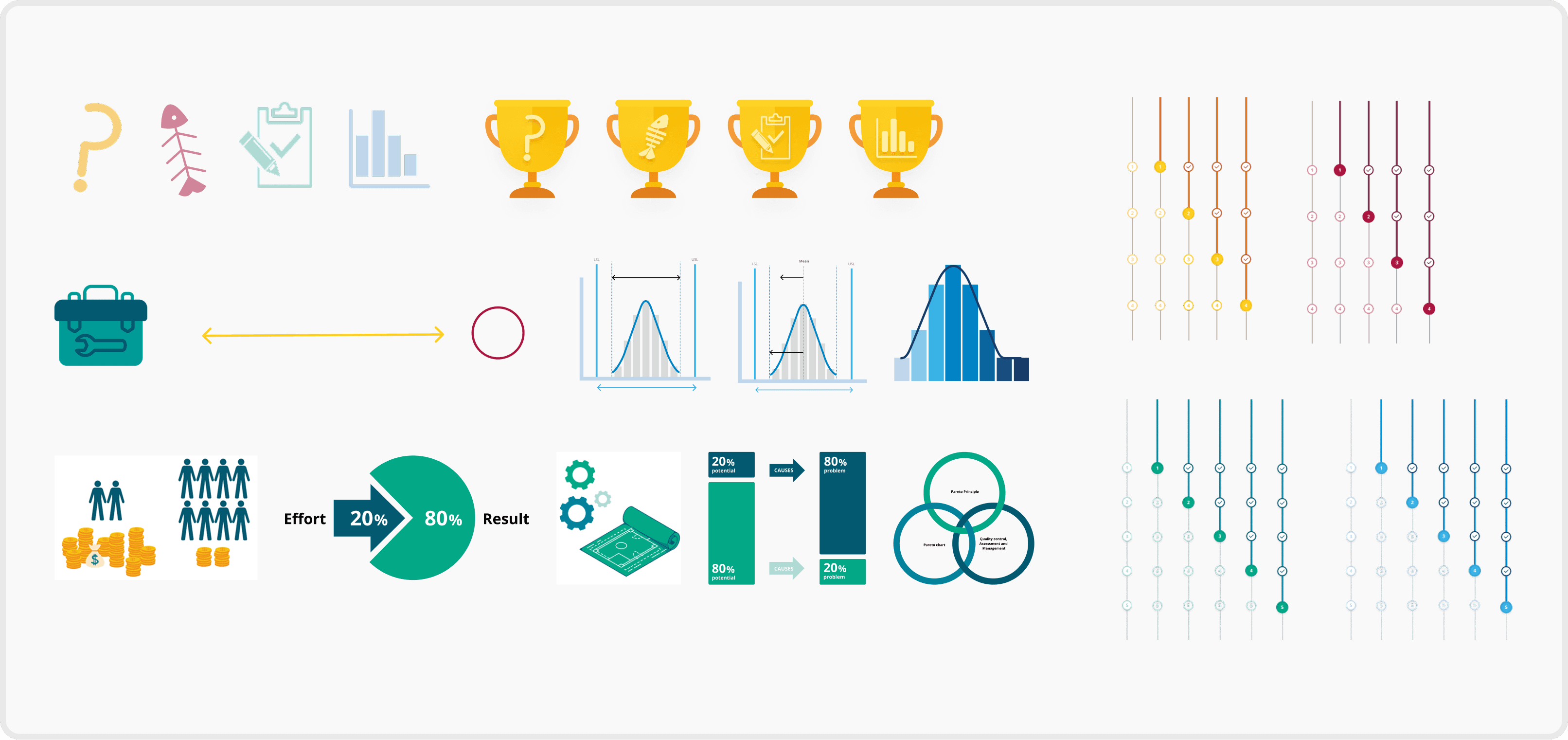
Illustrations & Infographics