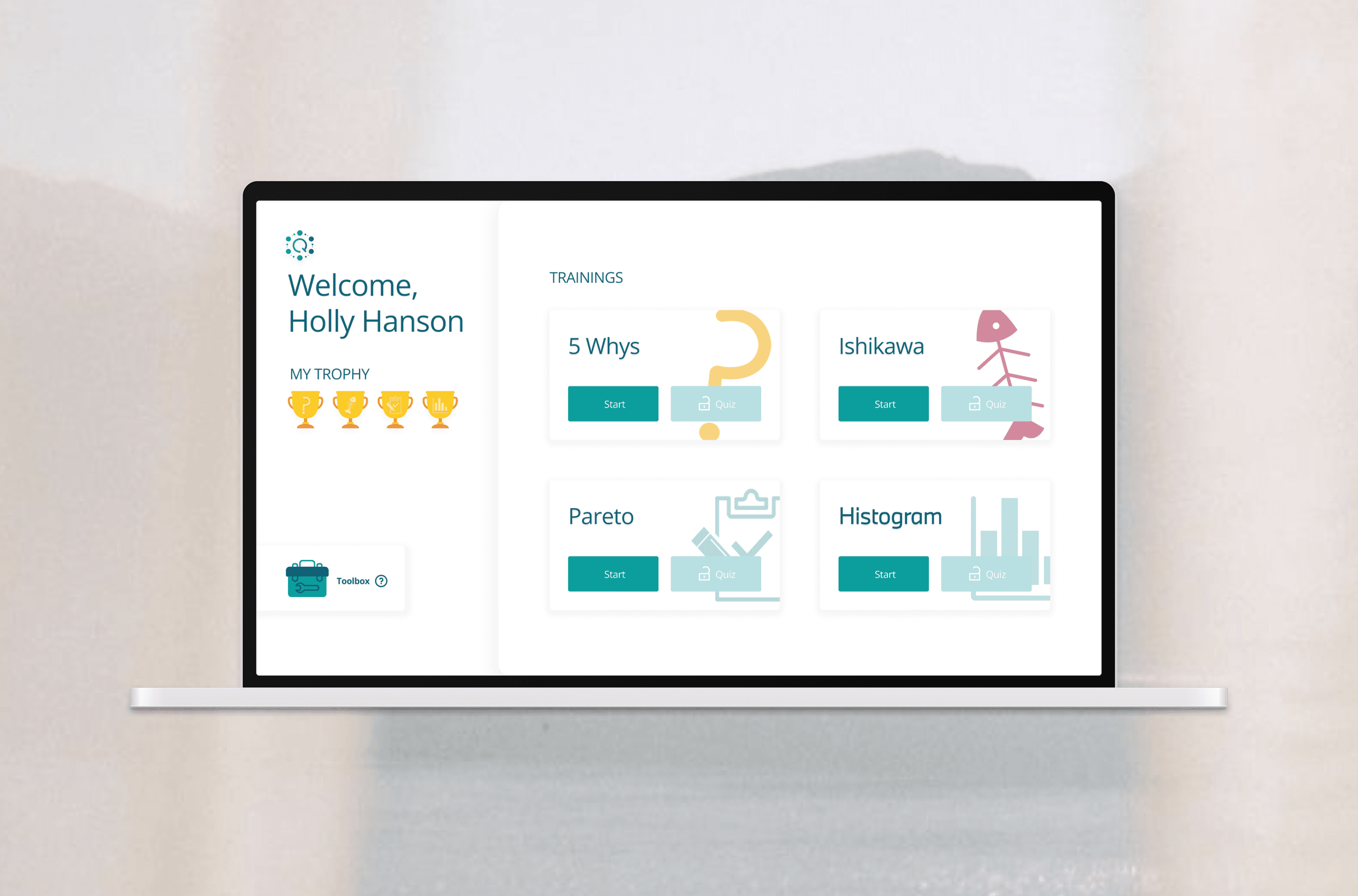
In use at BMW | Q Methods App
How Do You Make Training Easier to Learn at Scale?
Redesigning a multilingual training app to make quality learning more consistent, engaging, and user-friendly
Role
UX/UI Designer & Visual Identity Designer 100%
(Collaborate with 4 engineers)
Time Frame
4 months (alongside other projects)
Apr - Jul 2025
Tools
Figma, MS Power Apps & Photoshop
Client
BMW Quality Management Dept.(Germany, UK, US)
Currently published for desktop version /
Mobile version coming soon
Overview
Redesigning Quality Methods Easier to Learn
Project Background
The Q Methods App is a multilingual internal training application (80+ pages) designed to support BMW employees in learning quality management methods.
The Challenge
Despite its rich content, the existing app lacked visual consistency and presented information in a dense, unstructured way which making it difficult for users to absorb and navigate the material effectively.
The Approach
Working closely with the project lead (engineer), the app was rebranded and restructured to create a more cohesive and user-friendly experience.
Design Direction
The renewed design balances playfulness and professionalism, delivering an engaging learning experience without appearing childish—an explicit requirement from the project lead.
Challenges & Design Focus
Bringing Clarity and Consistency to Complex Content
01 Simplify Logo and Build a Design System
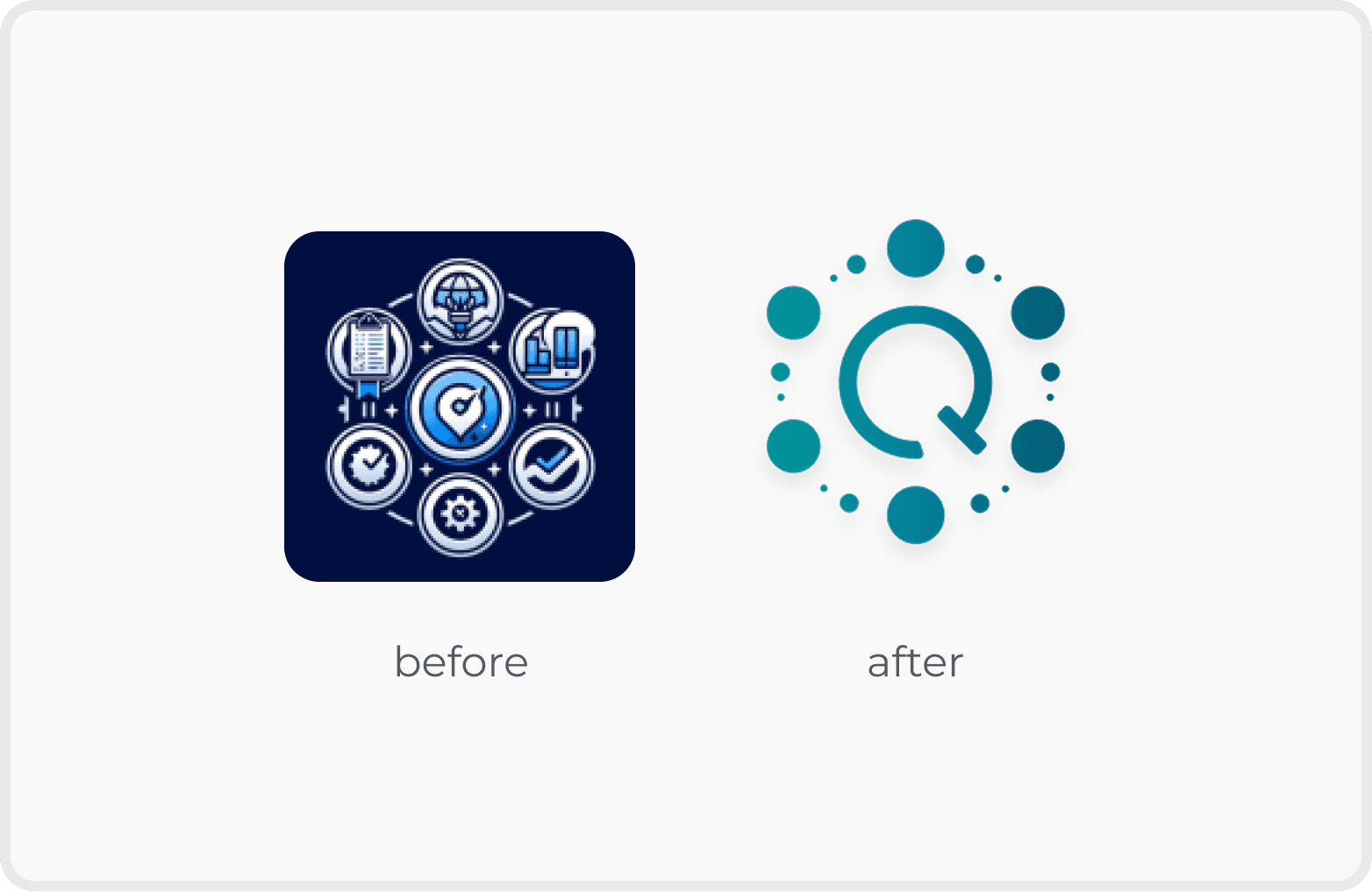
Logo Design
I retained the original shape and incorporated the letter ‘Q’ to represent the project’s identity, creating a simple and modern logo for the Q Methods App.

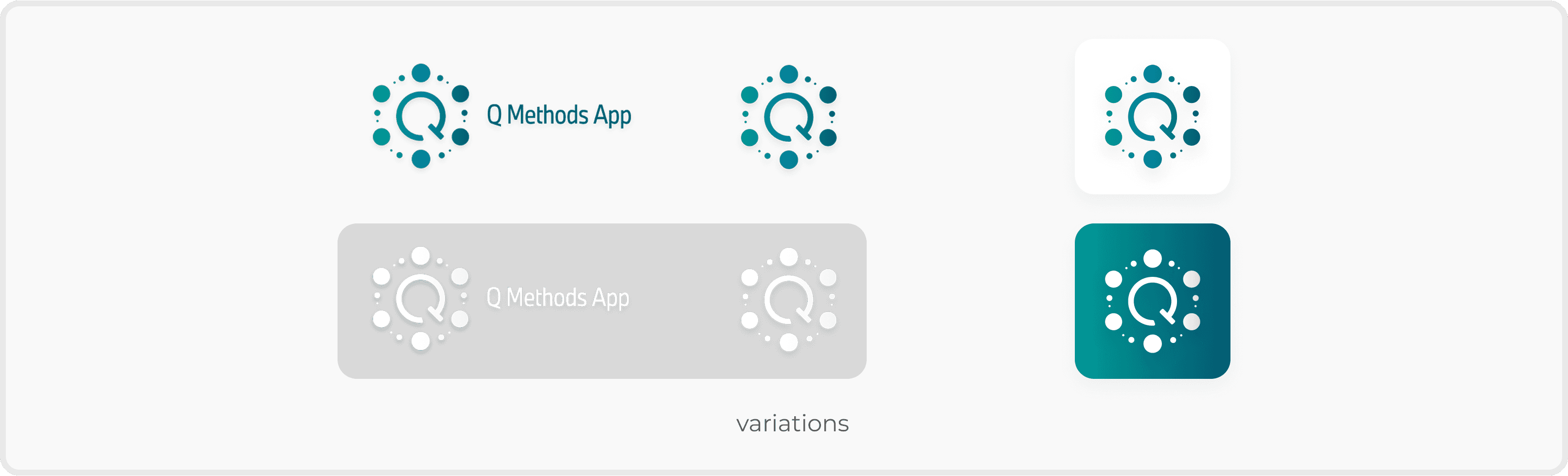
Logo Design
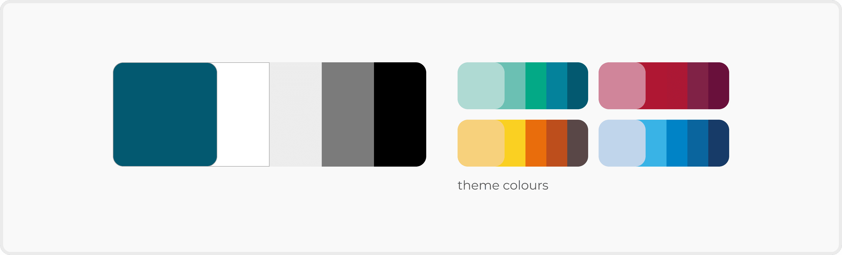
Colour System
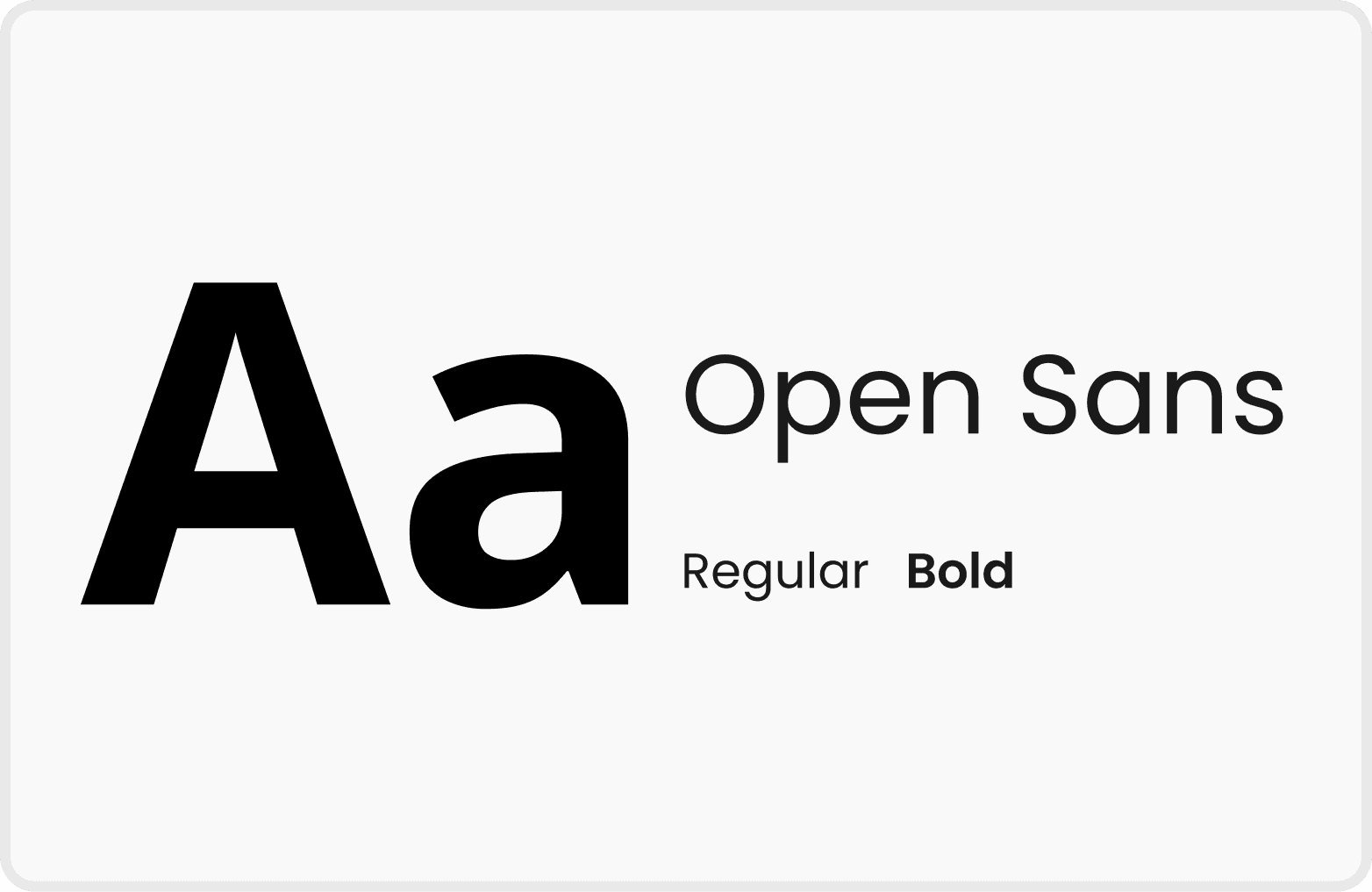
Font
02 Standardise Layout, Typography and Icons
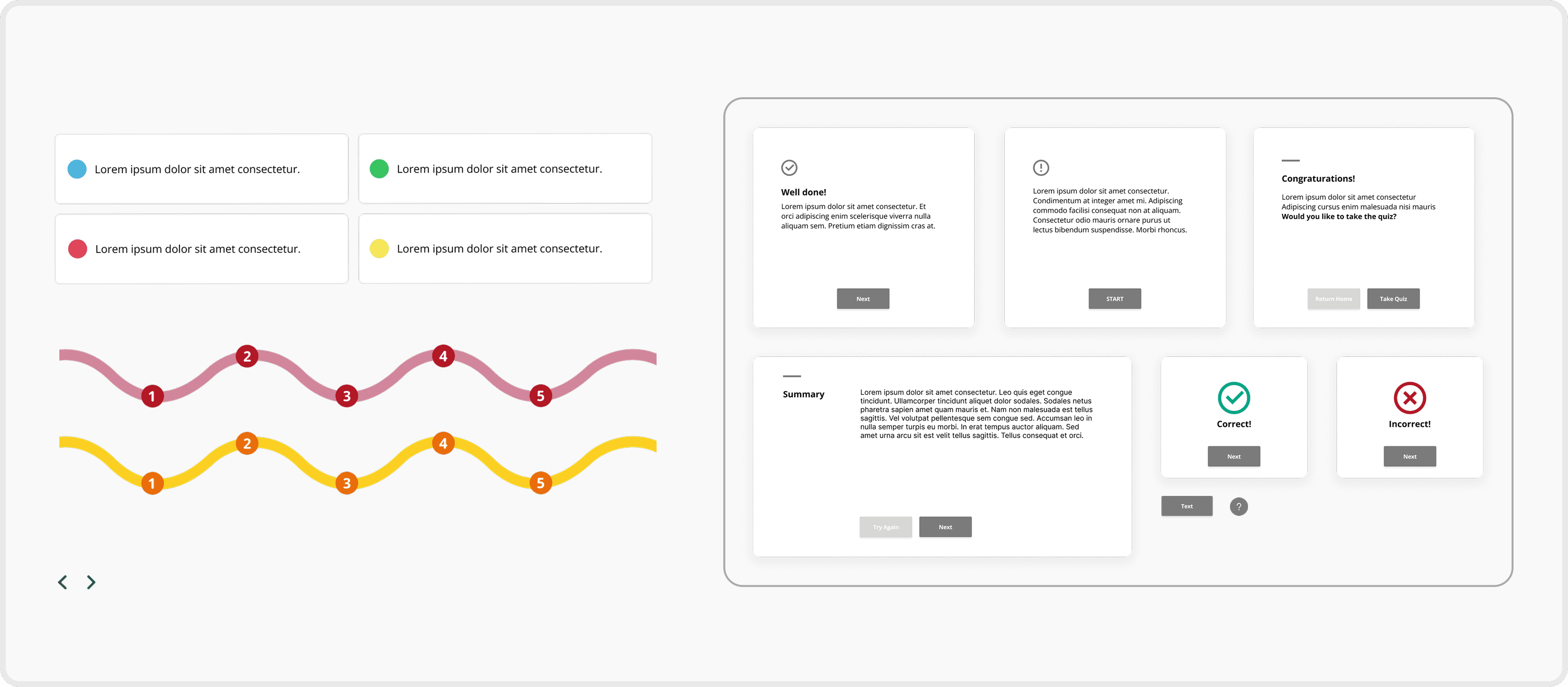
Components

Icons

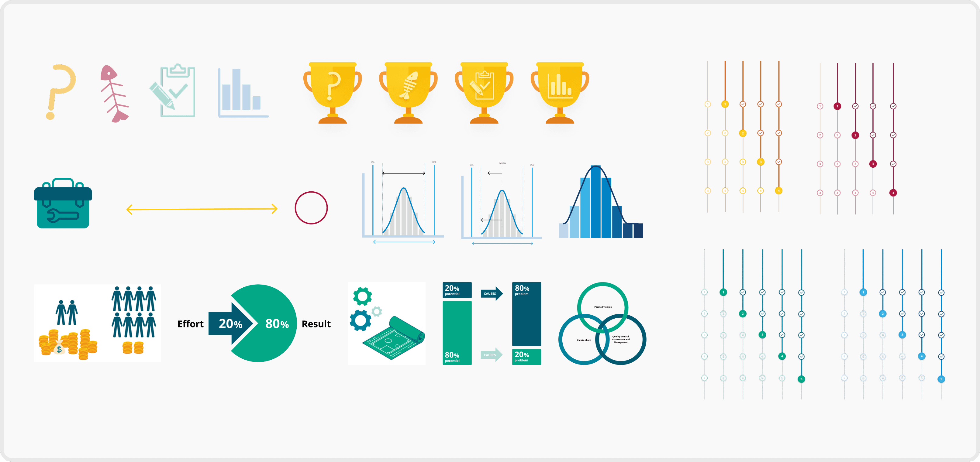
Illustrations & Infographics
03 Improve through Visual Hierarchy
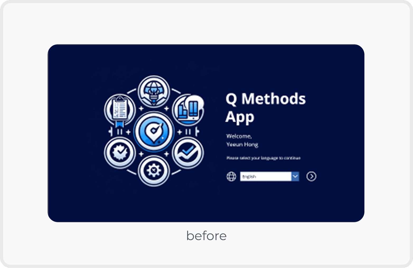
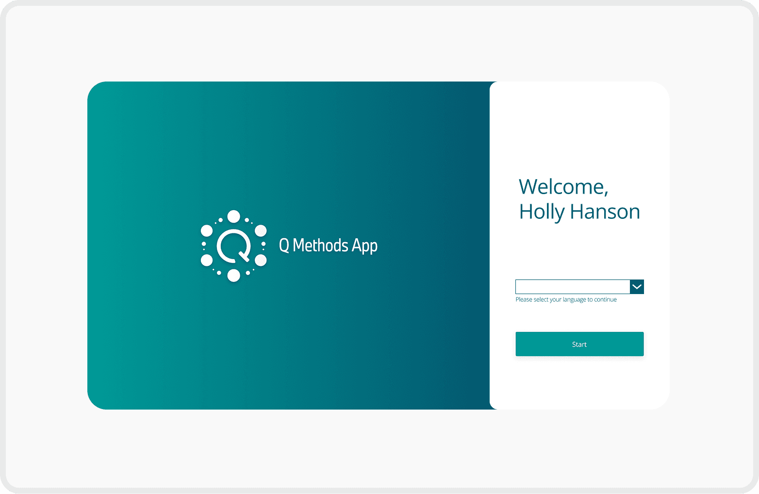
Balanced Visual Hierarchy
Reduced the logo size to balance the overall layout
Enlarged the "Start" button to enhance visibility and encourage user interaction
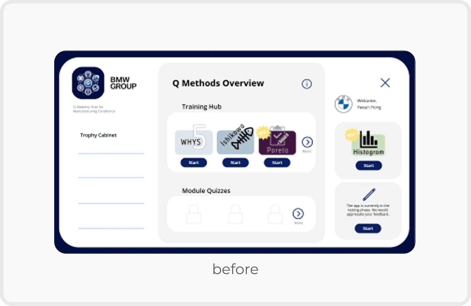
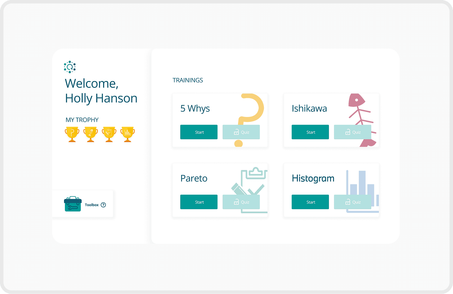
Clear Seperation for Better Focus
Improved user focus by clearly separating the profile section from the training list
Added unique icons to each training to help users quickly identify and differentiate content
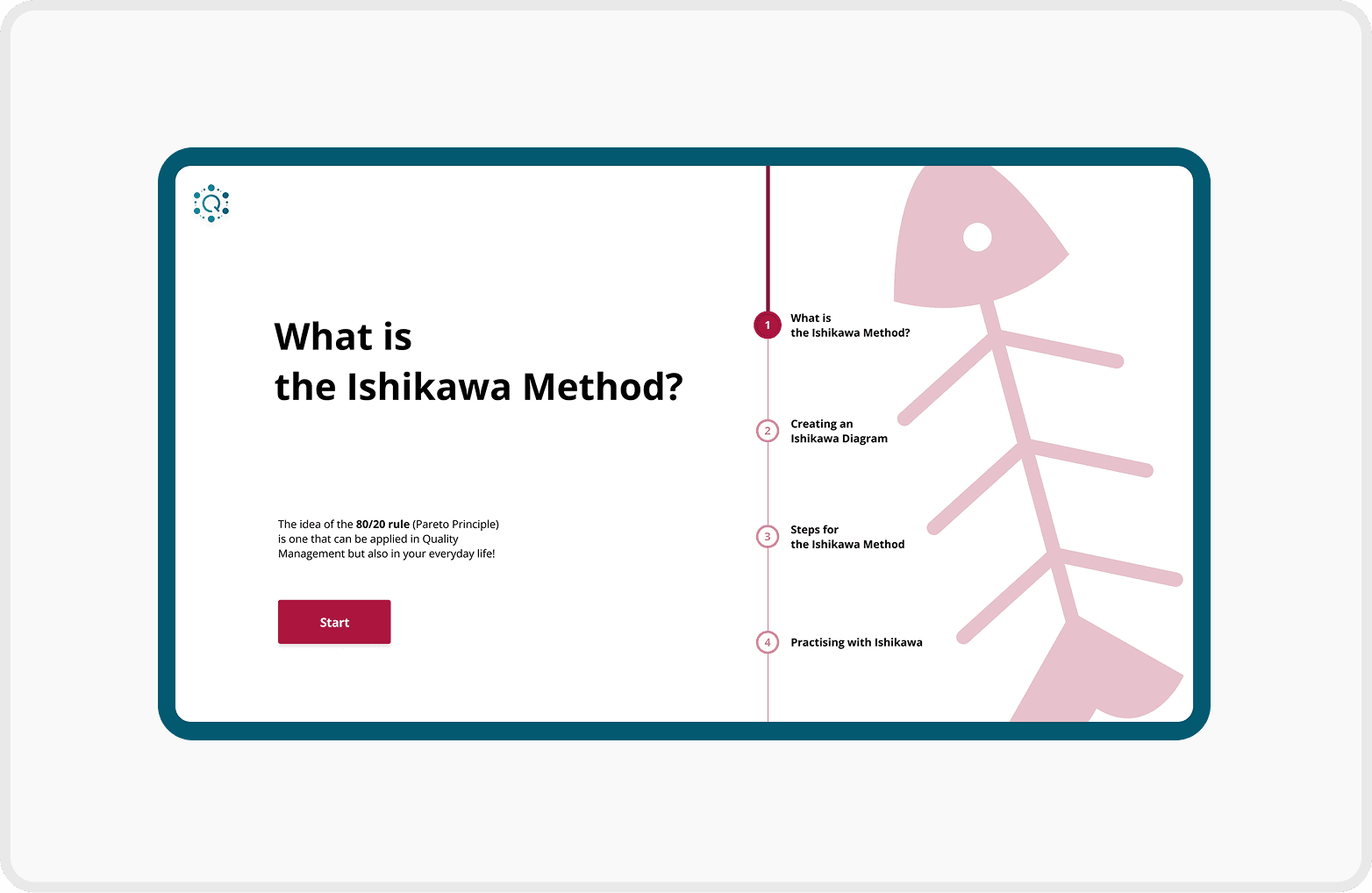
Structured Navigation with Progress Feedback
Introduced chapter overview pages for better context and smoother navigation
Added a progress bar to each chapter page to visually communicate learning progress
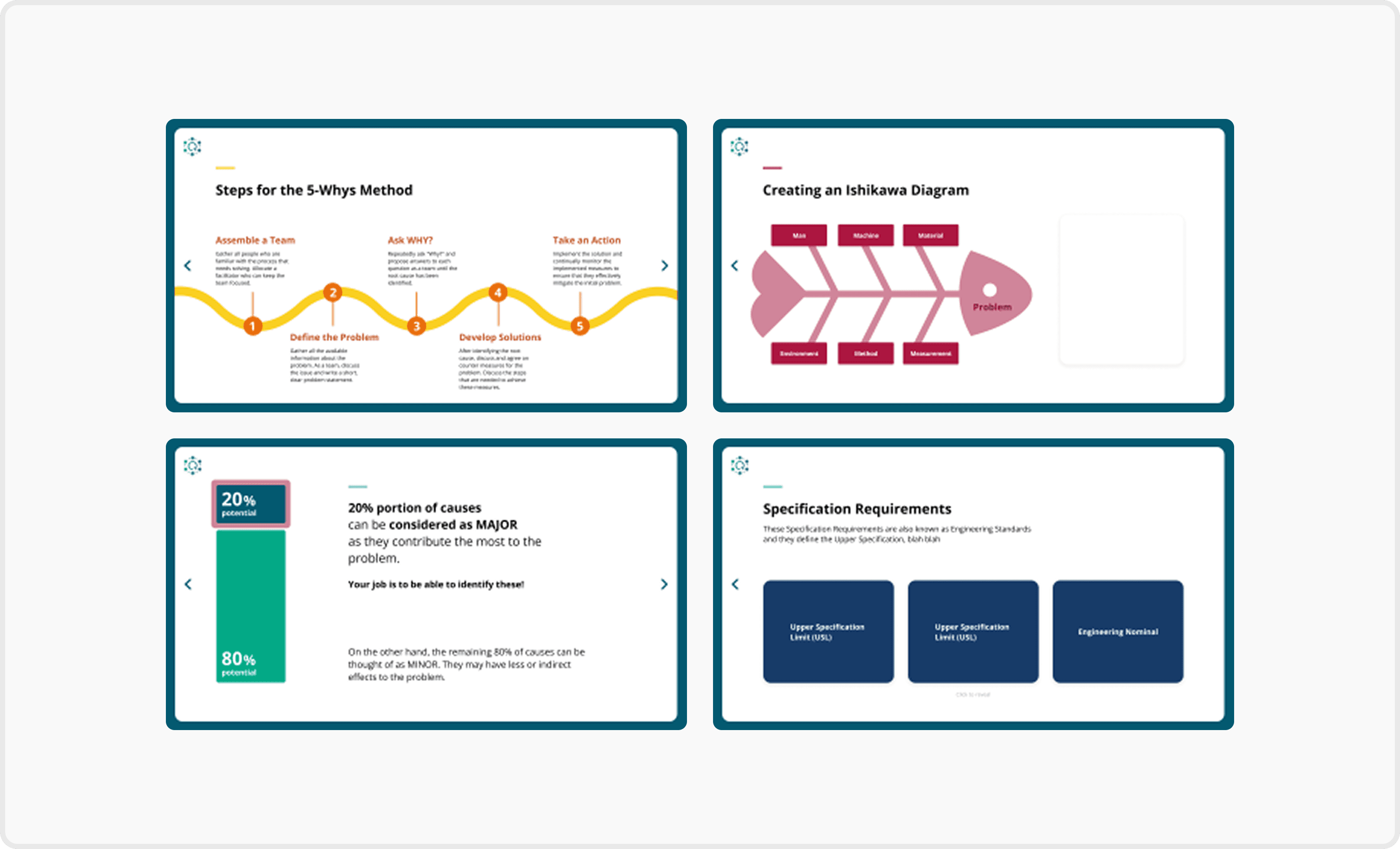
Visually Guided Contents Page
Added color-changing icons next to each training title to indicate the current selection
Used the brand’s green background to reinforce identity
Applied accent colours to distinguish each training and improve visual consistency
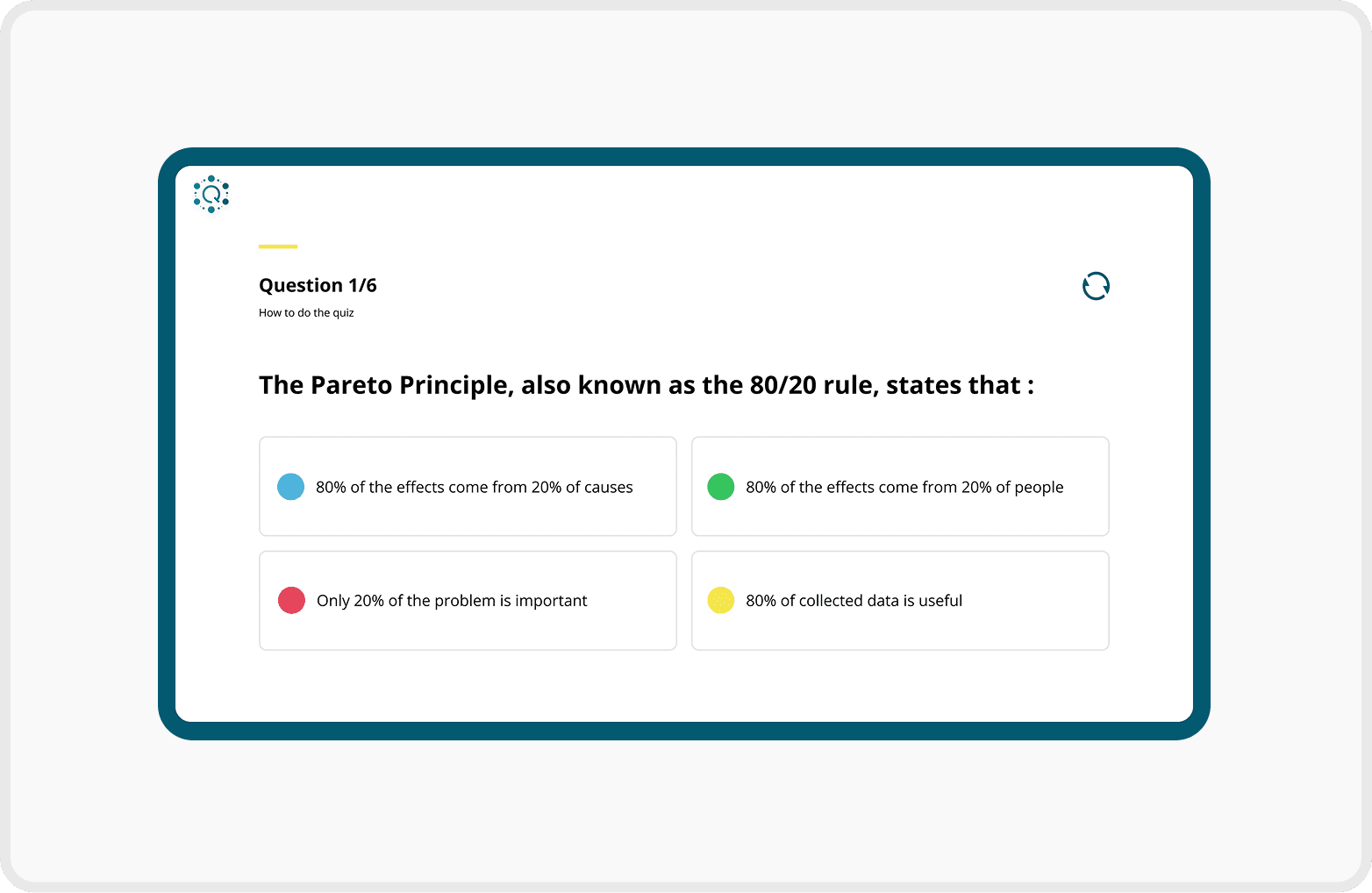
Clear and Interactive Quiz Layout
Included progression text (e.g. "Question 2/5") to inform users of their current position in the quiz
Applied different colours to each multiple-choice option to enhance visual separation and reduce cognitive load
Q Forum Launch & Internal User Testing

Reflection
Challenges & How I overcame them
Balancing Consistency and Distinction Across Modules
Challenges
Maintaining consistency across a large number of screens
Similar content across modules required clear differentiation
Solution
Unified shared page structures
Applied distinct accent colours to support module recognition
What I would do differently
Aligning Design Decisions Earlier with Technical Constraints
PowerApps scaled text and components differently than Figma
I would align designs with PowerApps behaviour earlier
Earlier collaboration with engineers would support a smoother handoff.
What I learned
Aligning Design Decisions Earlier with Technical Constraints
Designing requires understanding the development environment
UI/UX is not only visual. Technical constraints matter
Close collaboration with developers leads to realistic, buildable designs